|
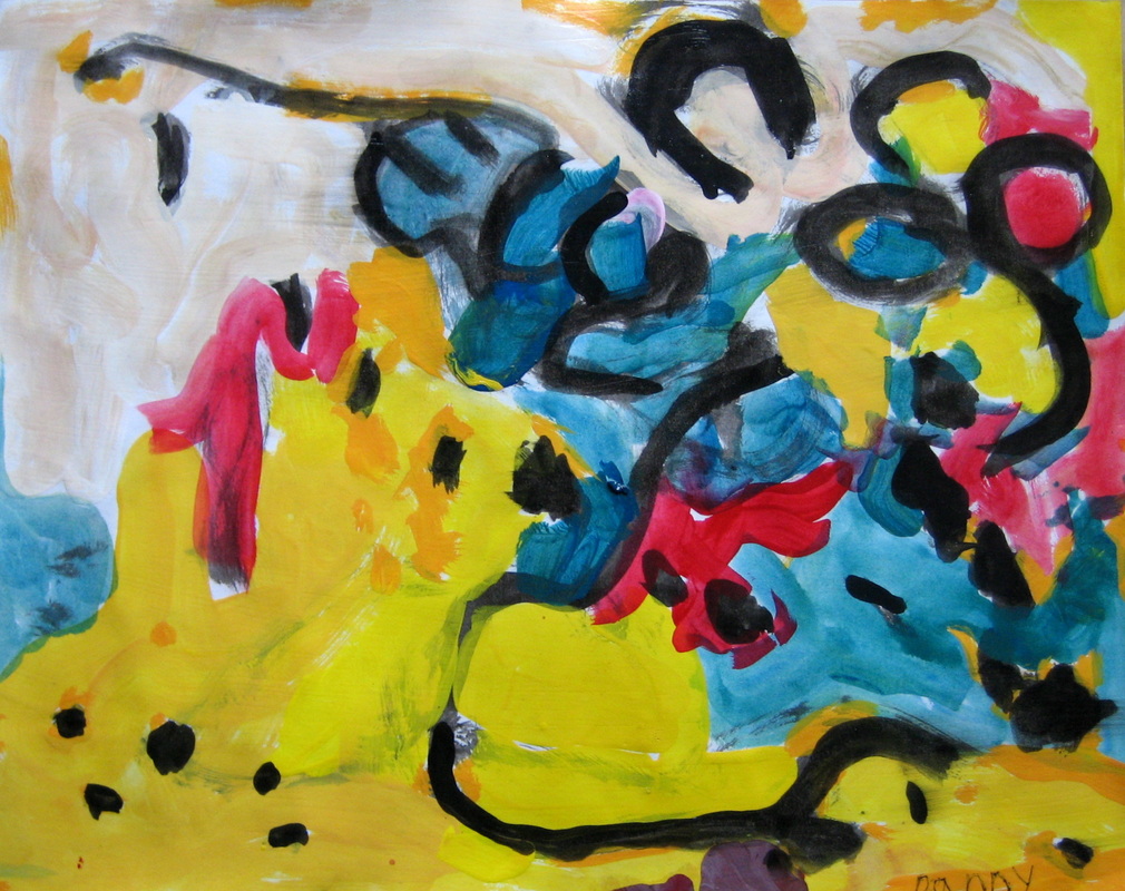
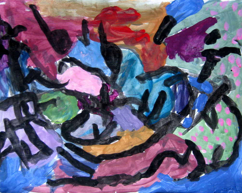
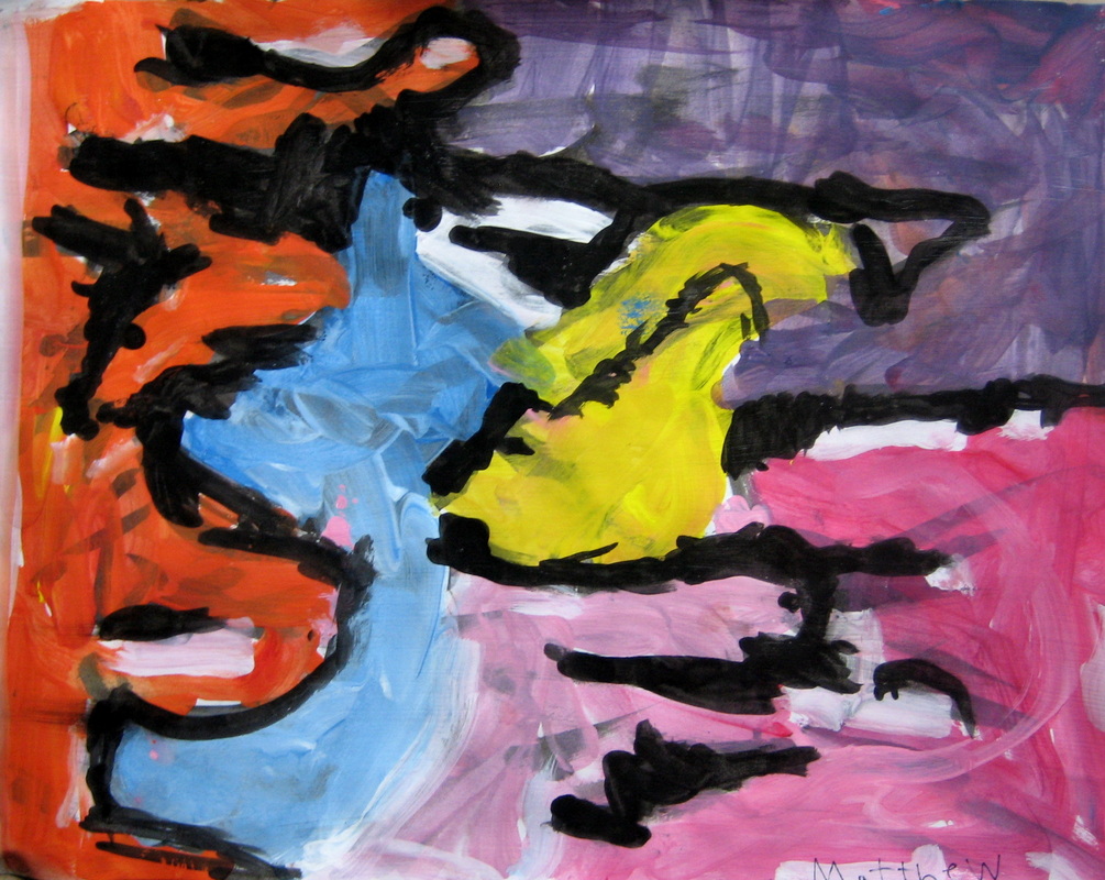
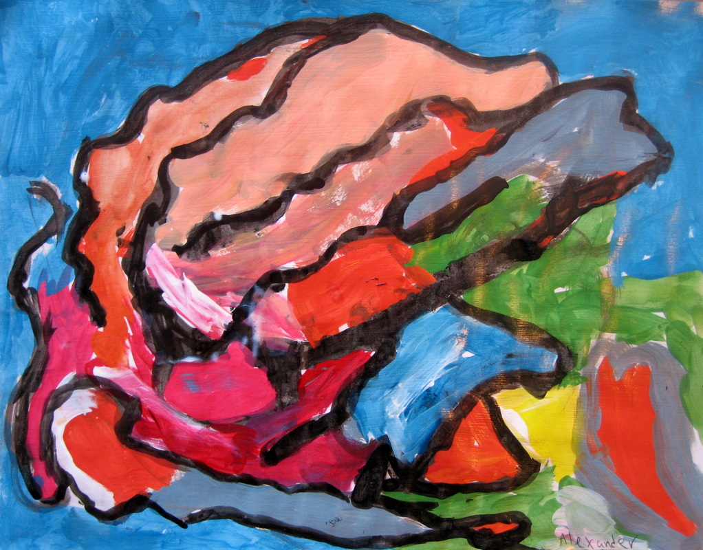
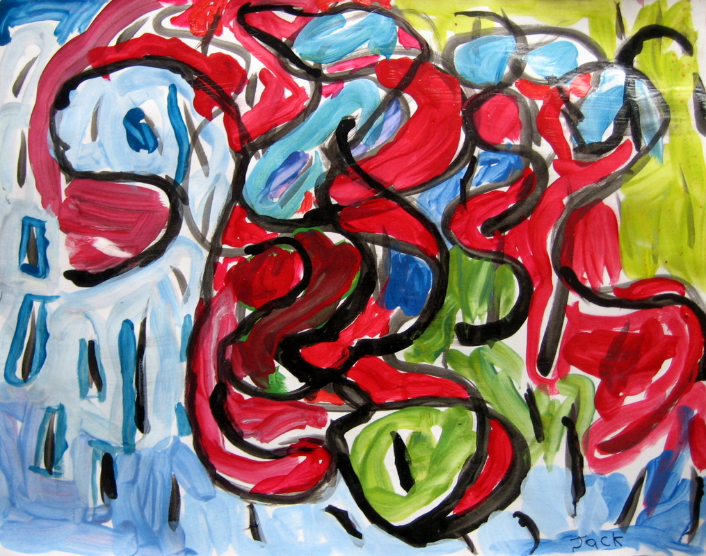
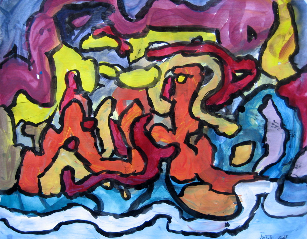
At the beginning of class, I held up images of Kandinsky's paintings. One of my students declared, "That's not art stuff!" Exactly the kind of reaction Wassily Kandinsky received when he exhibited his work in the 1900's. Can you imagine?! At the time art was all about making things look real! I went on to explain... Instead of a making a realistic picture, Kandinsky wanted to express emotions using lines and color. He was very inspired by music. He was one of the first artists to paint abstract pictures. He was also involved the development of Expressionism. While listening to Mozart's Serenade No. 13 in G Major 'A Little Night Music', Allegro, my painting class of 1st and 3rd graders expressed themselves in much the same way. Using lines, shapes and color, they expressed what they heard and felt in the music. By the end of class, that same young artist was enthusiastically giving titles to this different way of doing art - "Color Sound" & "Color Power". I am captivated by the results! "I applied streaks and blobs of color onto the canvas with a palette knife and I made them sing with all the intensity I could...” If you are interested in the steps in the lesson after introducing Kandinsky:
I also taught this lesson with the 3rd graders at my sons' school. This time, we listened to David Brubeck's Blue Rondo A La Turk. (There is a significant tempo change about 2 minutes in.) I don't have the photos or the permission to post those - I wish I did! I am not an abstract painter, but in my contemporary floral paintings, I definitely use color and shape to express and evoke emotion.
0 Comments
In drawing class, we reversed the shading process and drew with white colored pencil on black paper. We continued to look for light, medium and dark values while creating texture with our strokes. Just look at all those wonderful marks! 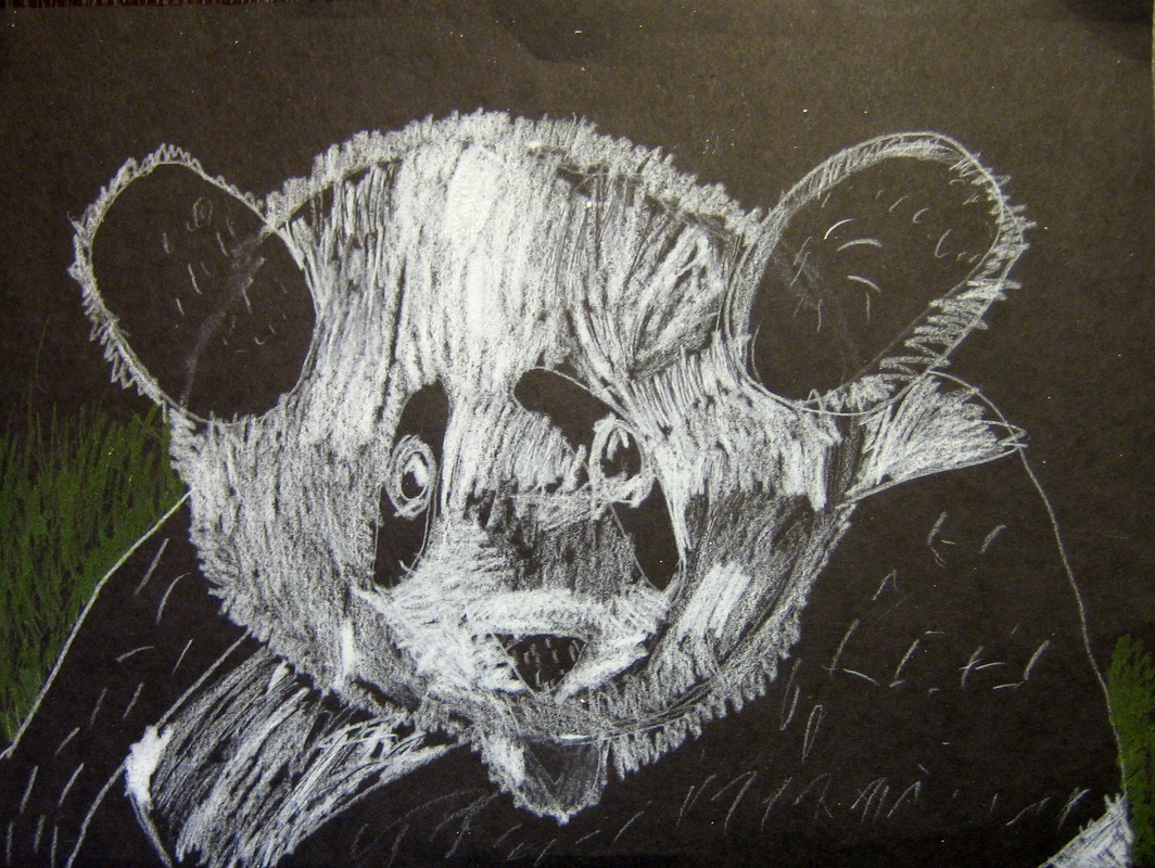 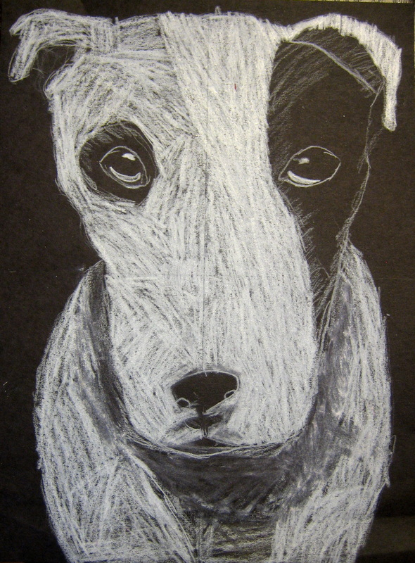  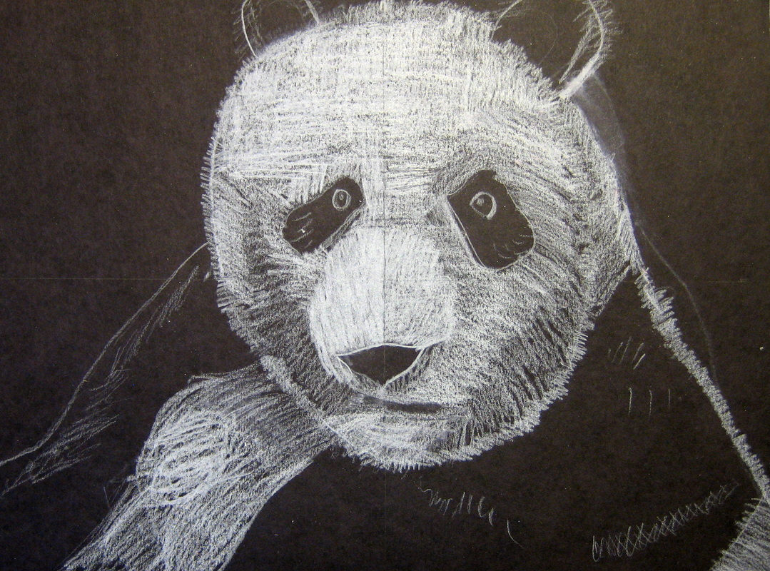 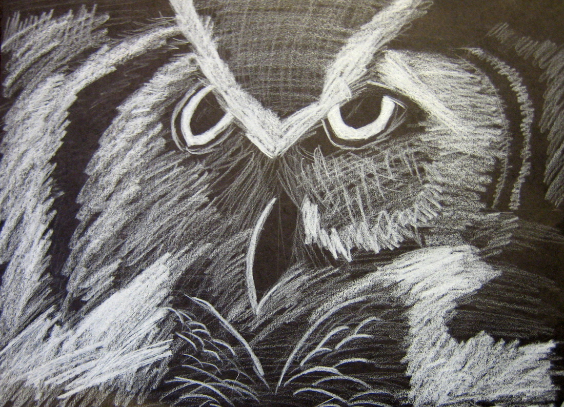  Click here for the current class schedule.
When I was growing up, I spent hours on the tire swing in our backyard - swingin', thinkin' and watchin' the world around me.  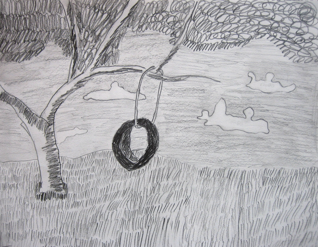 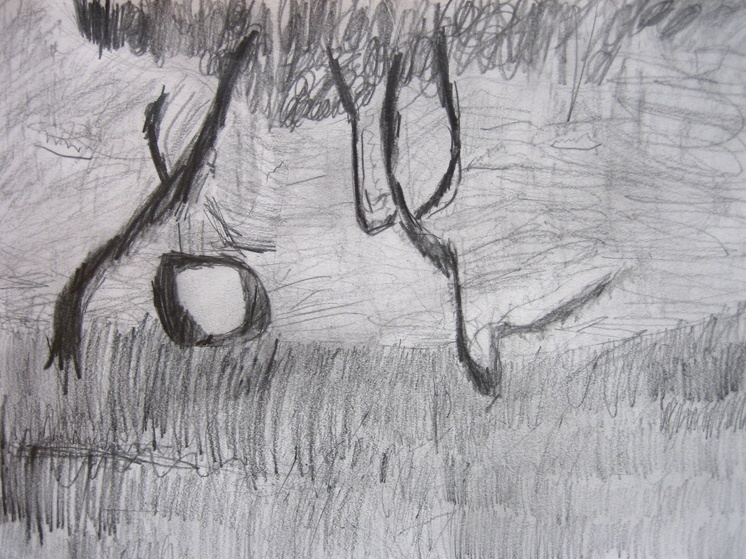 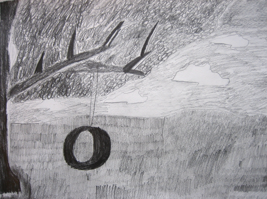   Using a variety of pictures for reference, my young students drew a tree, a horizon line (where the sky meets the ground), a tire swing and clouds. How they arranged their composition was up to them.
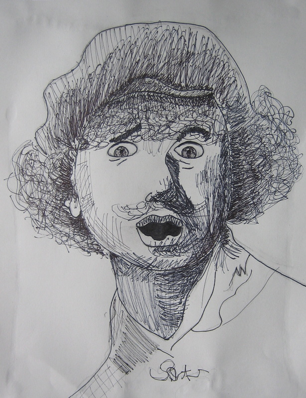
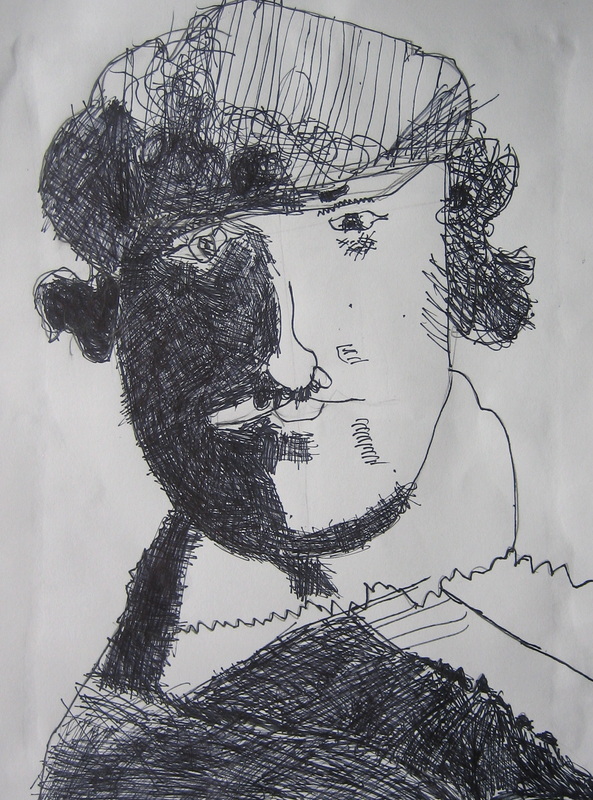
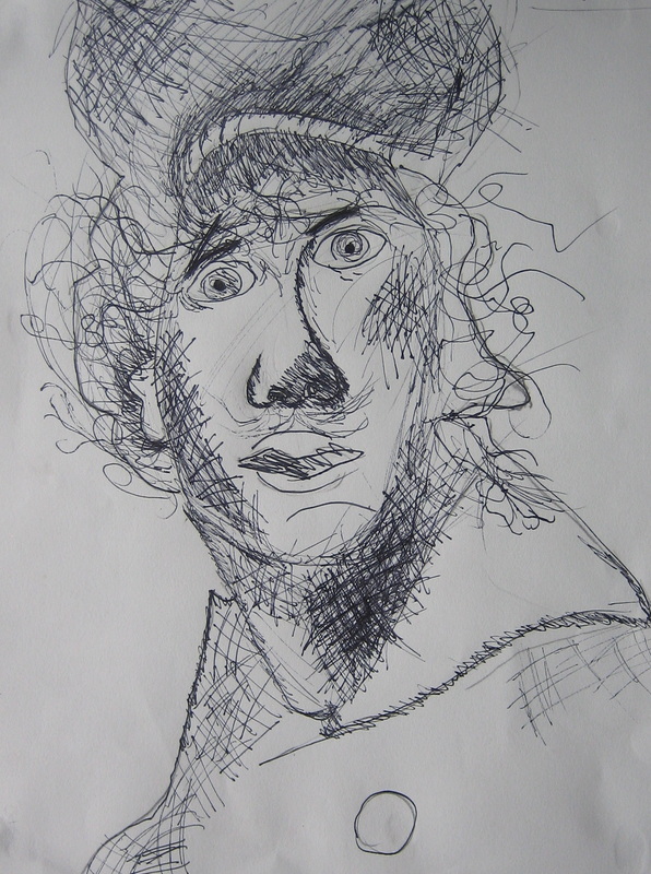
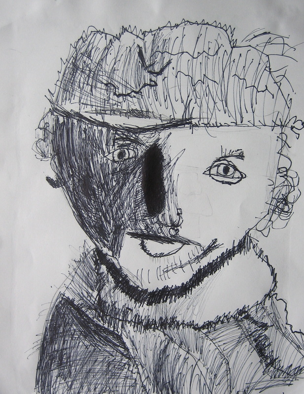
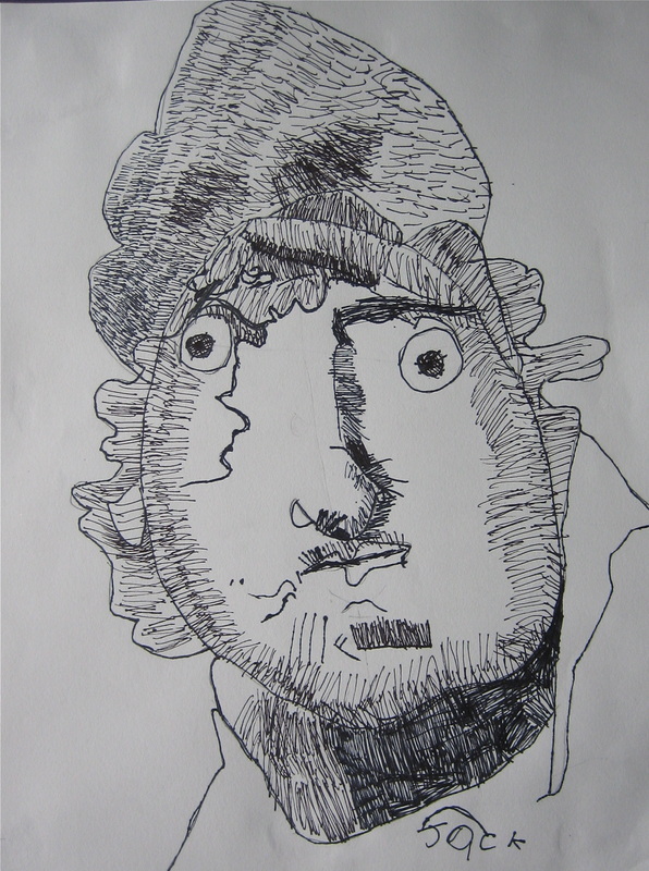
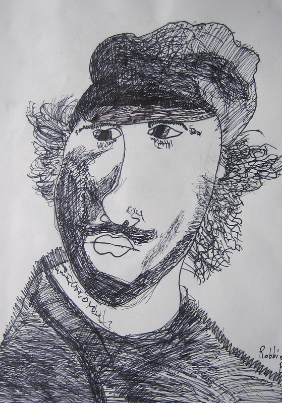
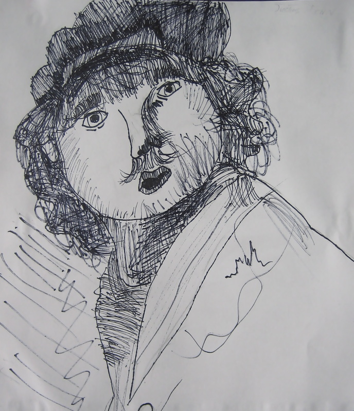
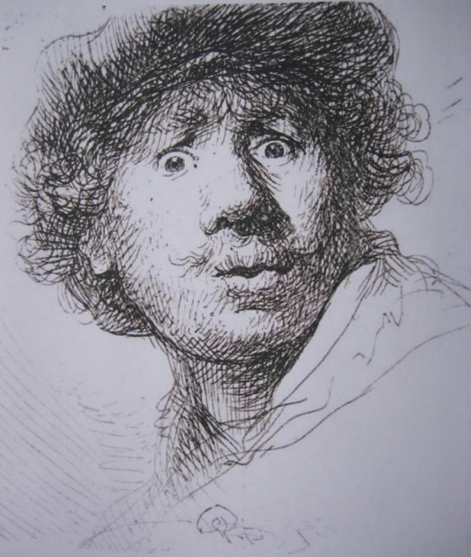
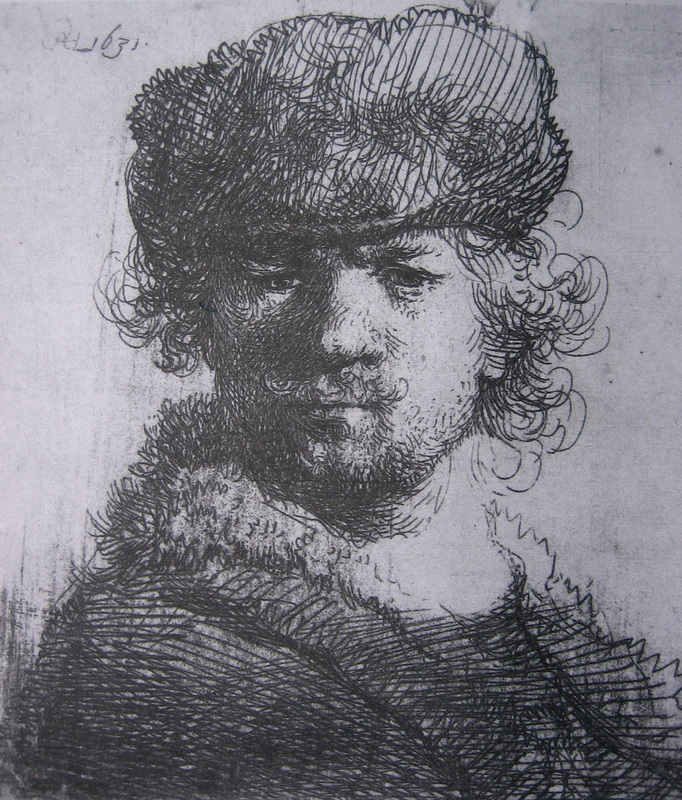
Then, we went in with our No. 2 pencil! Depending on which part of the drawing we were working on, we used our pencil in different ways to create light, medium and dark values (shading) and a variety of textures (how something would feel if we could touch it). It was actually snowing and blowing outside while we worked on these drawings. So - using masonite boards to support our paper, we gathered around the fireplace to create! :) My Thursday afternoon class for grades 1-5 studied the expression, shapes, values and lines in these two self-portraits by Rembrandt. Their pen & ink renditions make me smile!
       I'm working on more paintings for Central DuPage Hospital and Cadence Health. Coming soon...
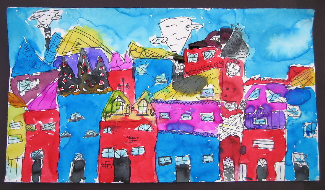
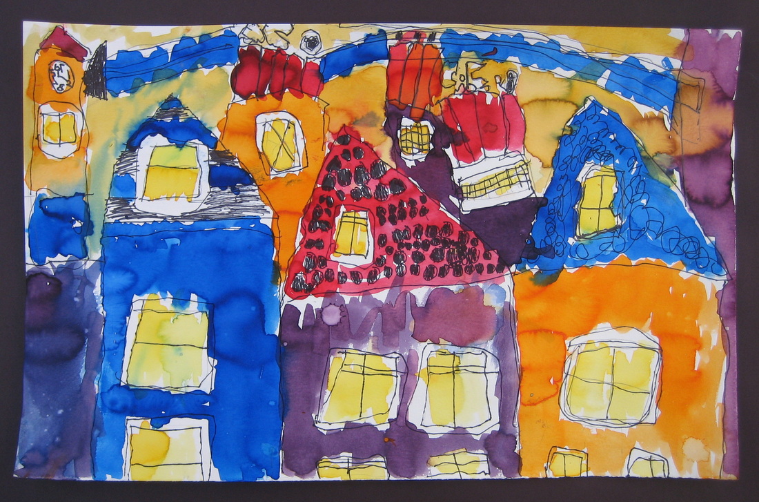
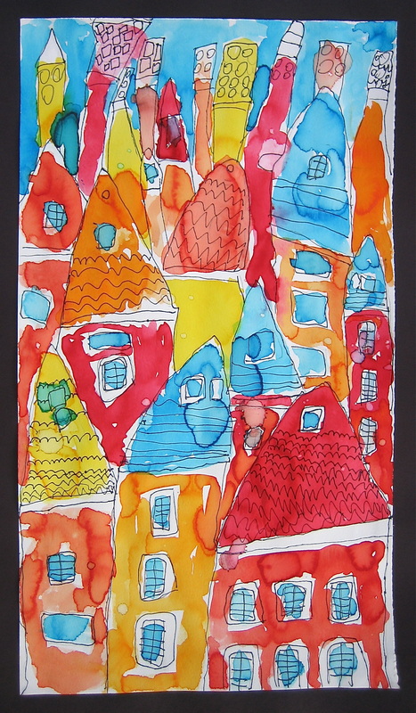
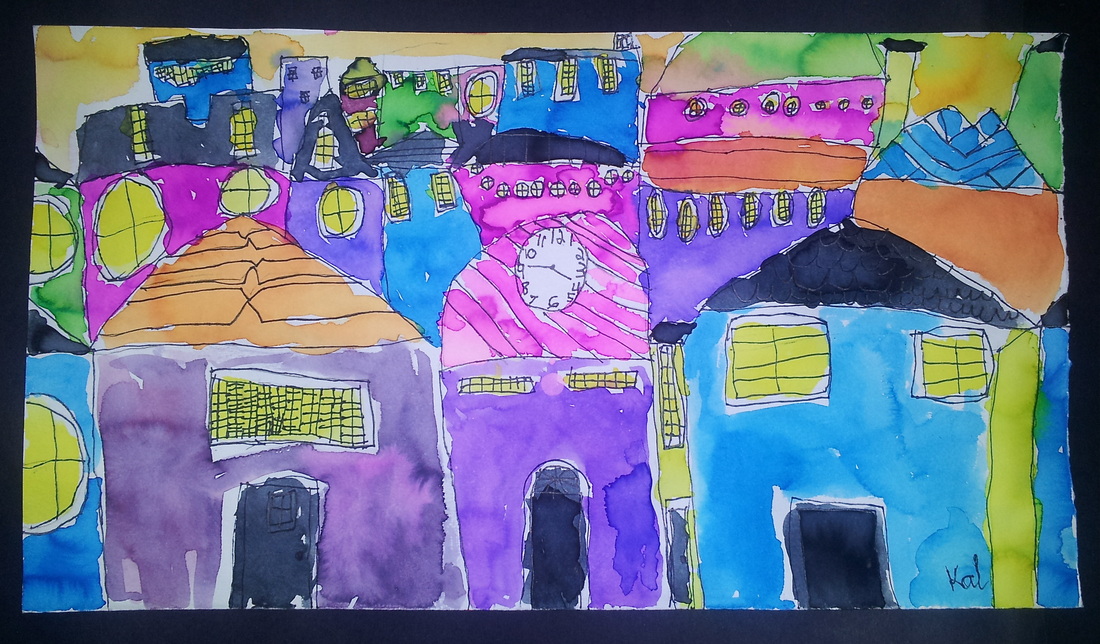
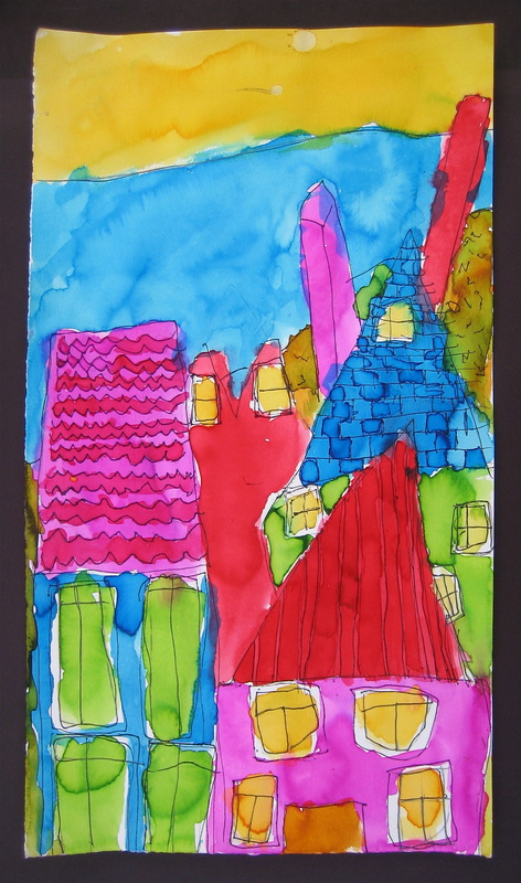
The kids and I talked about leaves falling, drifting, twirling and blowing with a gust of wind. They each choose a description and put their leaves in motion! On black construction paper, step-by-step: After choosing and drawing a single leaf, each student created their own stencil by cutting the leaf out and tracing it to create an interesting composition. They were encouraged to overlap, turn the leaves in different directions, and let a leaf or two go off the page. Keeping the tip of the glue bottle on the paper, the compositions were outlined with glue (Crayola washable school glue dries nice and clear - leaving a black outline.). The glue was allowed to dry (overnight at least) before we went in with oil pastels, mixing and blending 'neighbors' on the color wheel. Our final step included looking for ways to include light and dark values. Enjoy!   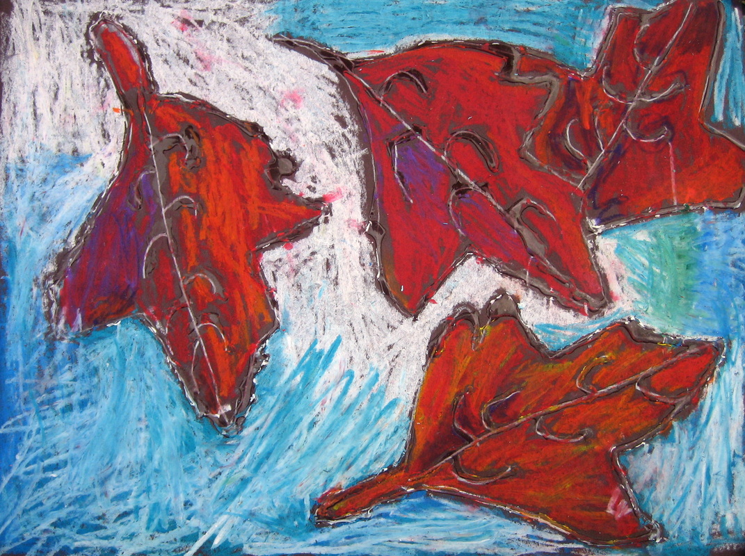 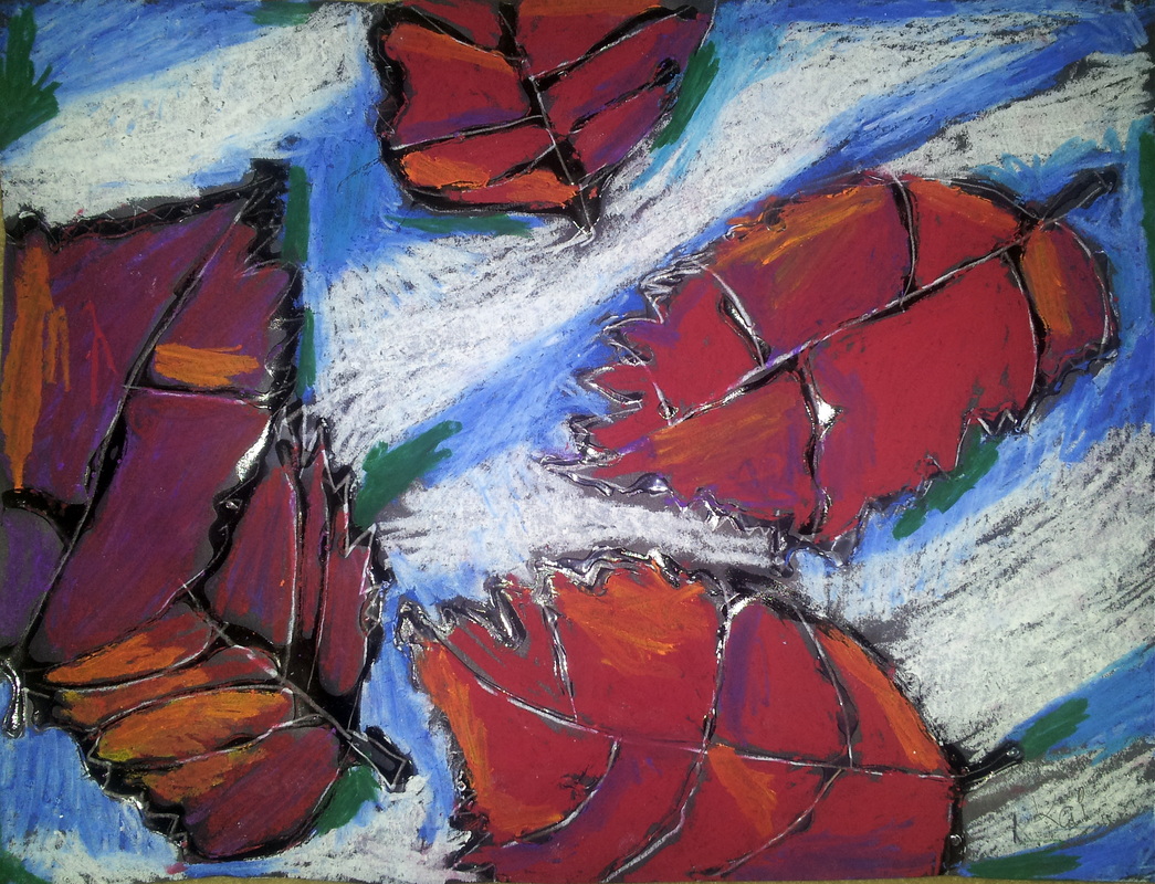  The kids and I have been exploring the wonderful world of color! In our Fall I session of 'Color Explosion', we started out by drawing buildings as if they were stacked on a hillside - inspired by images of super colorful cities around the world. We talked about overlapping and shapes becoming smaller as they get further away. Each student added their own unique details to the architecture. We then dove into color using liquid watercolors (SO vibrant!). We tried to limit our color palette and we used repetition by repeating the same color in different places around the painting. Viola!
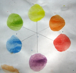 I'm not a fan of them in my house, but I love them on paper! In our final week of summer classes, we zoomed in on the insect world (and one spider). Looking at the lines and shapes of the head, thorax and abdomen, we constructed our 'bugs'. Referring to the color wheel, we mixed analogous colors (neighbors on the color wheel) and used complementary colors (opposites on the color wheel) to give our paintings a pop of contrast. All the while, we kept our watercolors juicy - but in control. 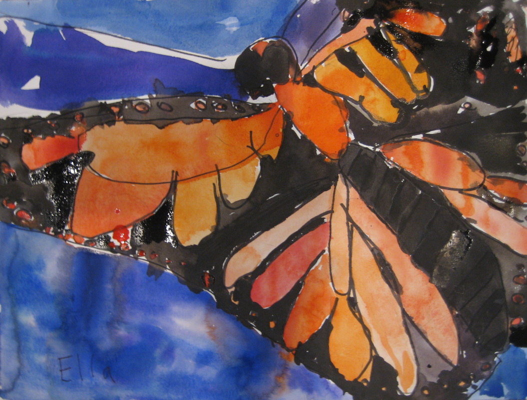 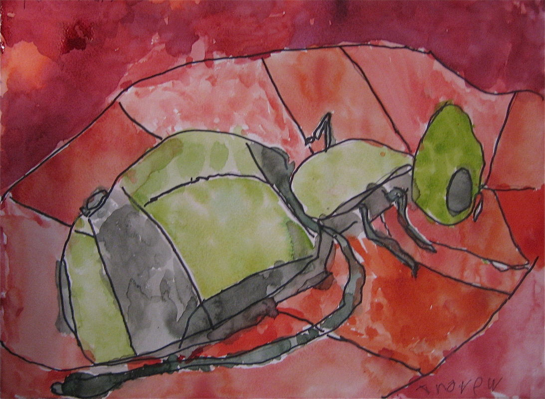  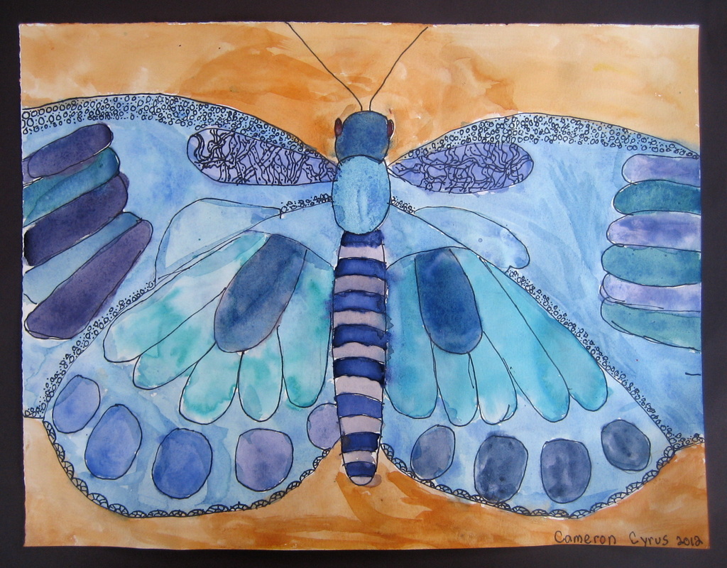  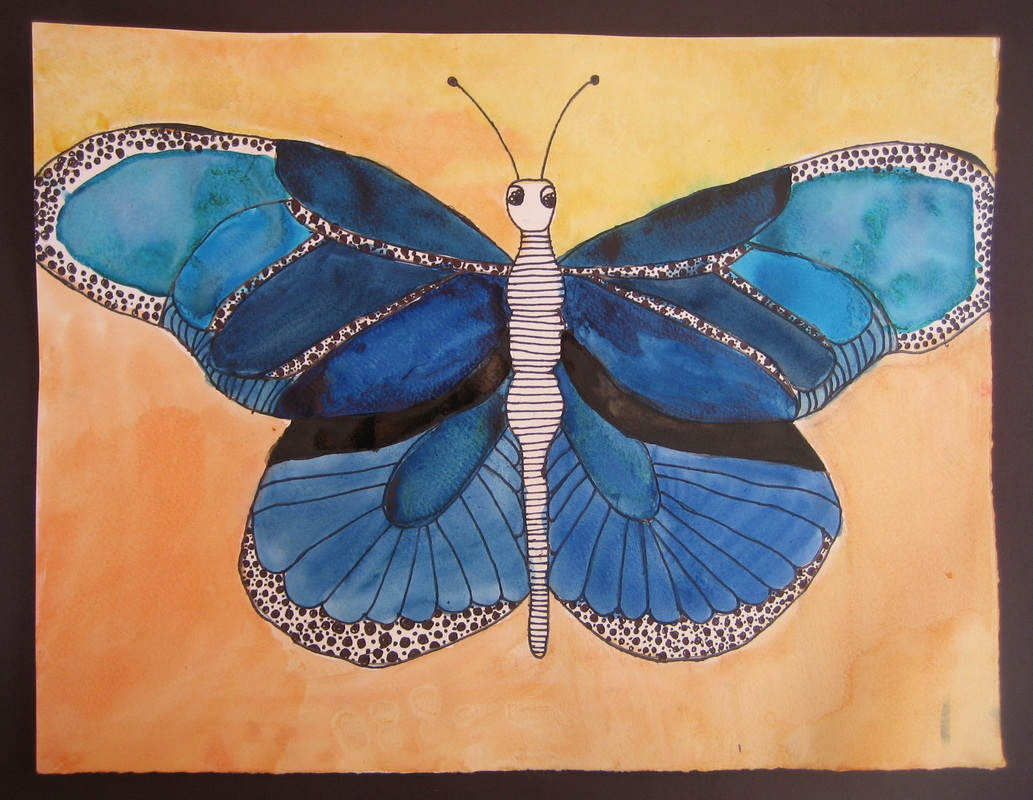 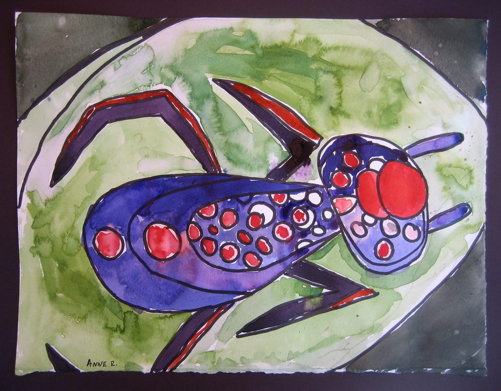 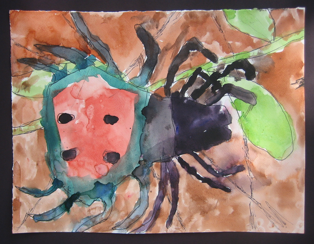 Summer art classes are now finished. It's so fun to look back at what we created! In this week's class, students painted a 'self-portrait' inspired by George Rodrigue's Blue Dog. After creating a strong drawing, students painted light, medium and dark values. They then chose one thing to communicate about themselves. Enjoy! I have more to show you from these great kids - soon!
Click on any of the images below to meet our cartoon character creations.  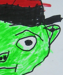 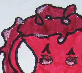 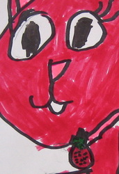 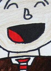 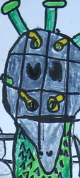 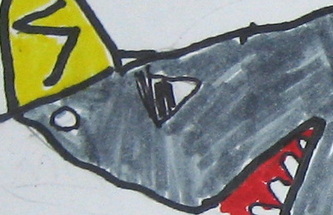 |
Dawn Eaton
Welcome! Archives
April 2019
Categories
All
|
 RSS Feed